Pride for Youth - U=U Creative Direction, Branding, Print + Digital Advertisements, Email Marketing, Web Design
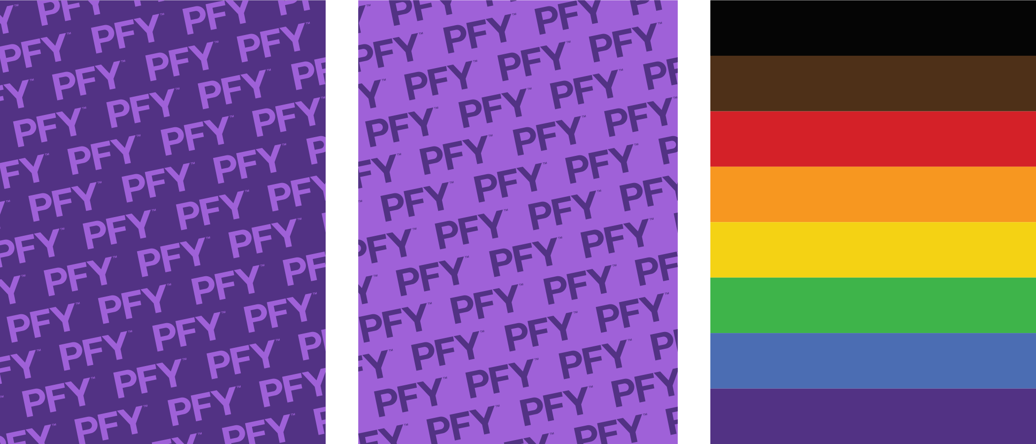
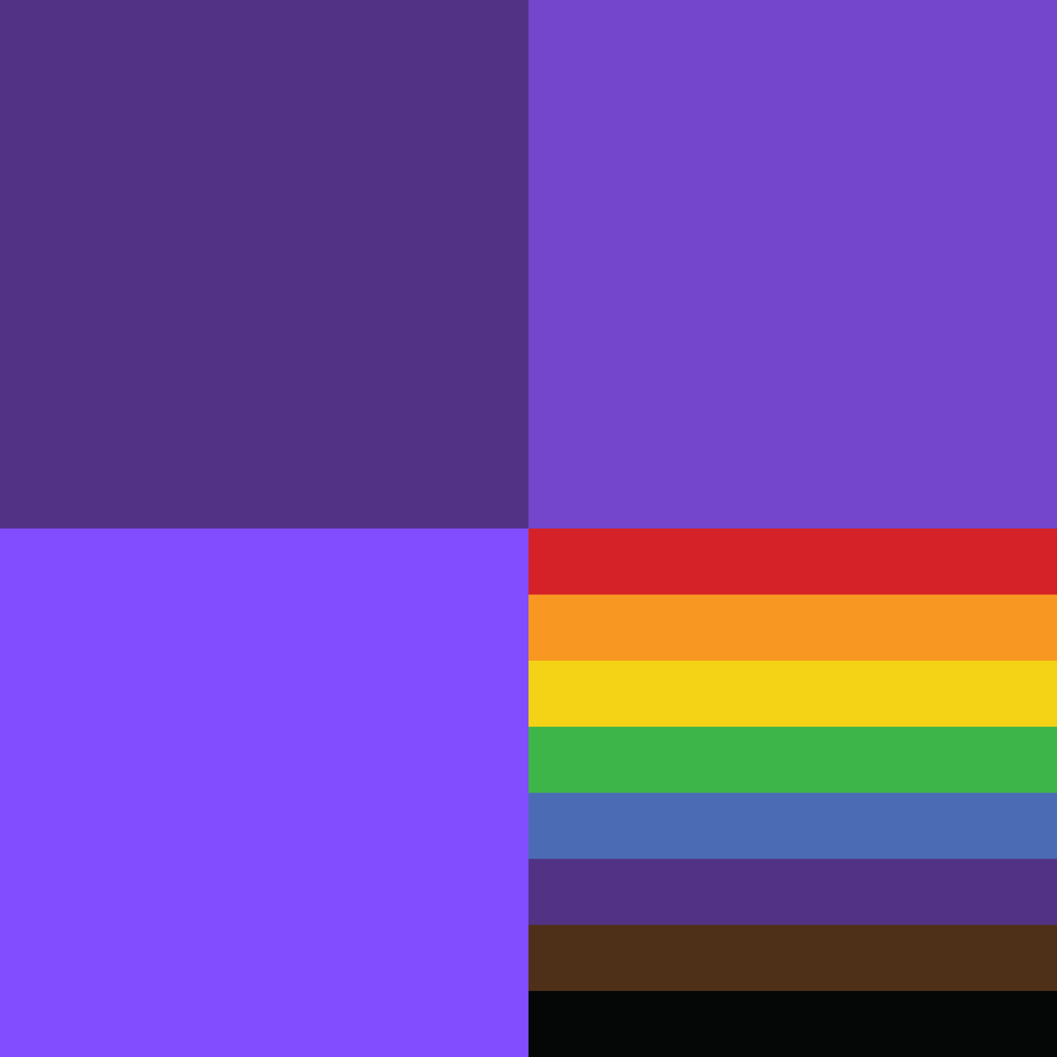
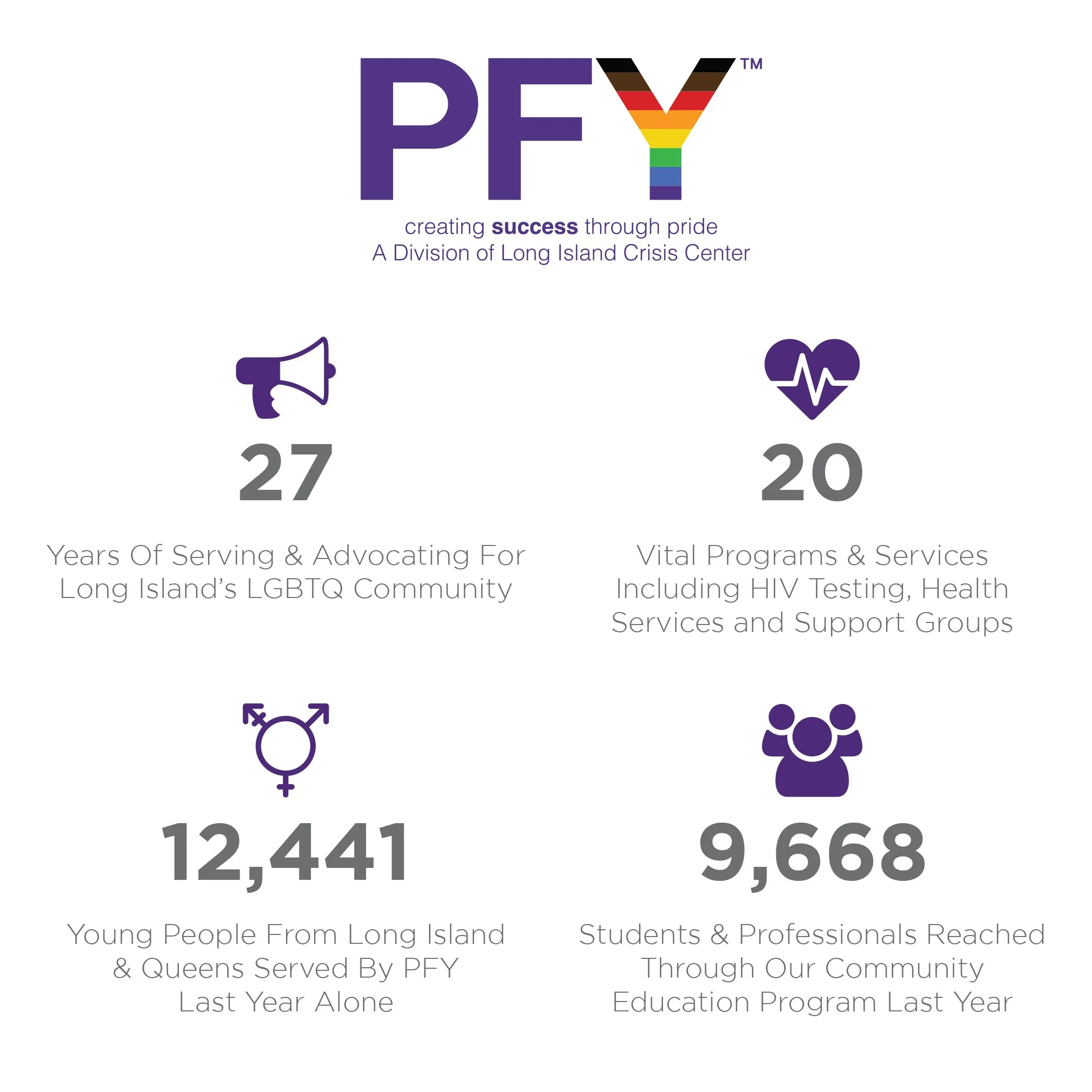
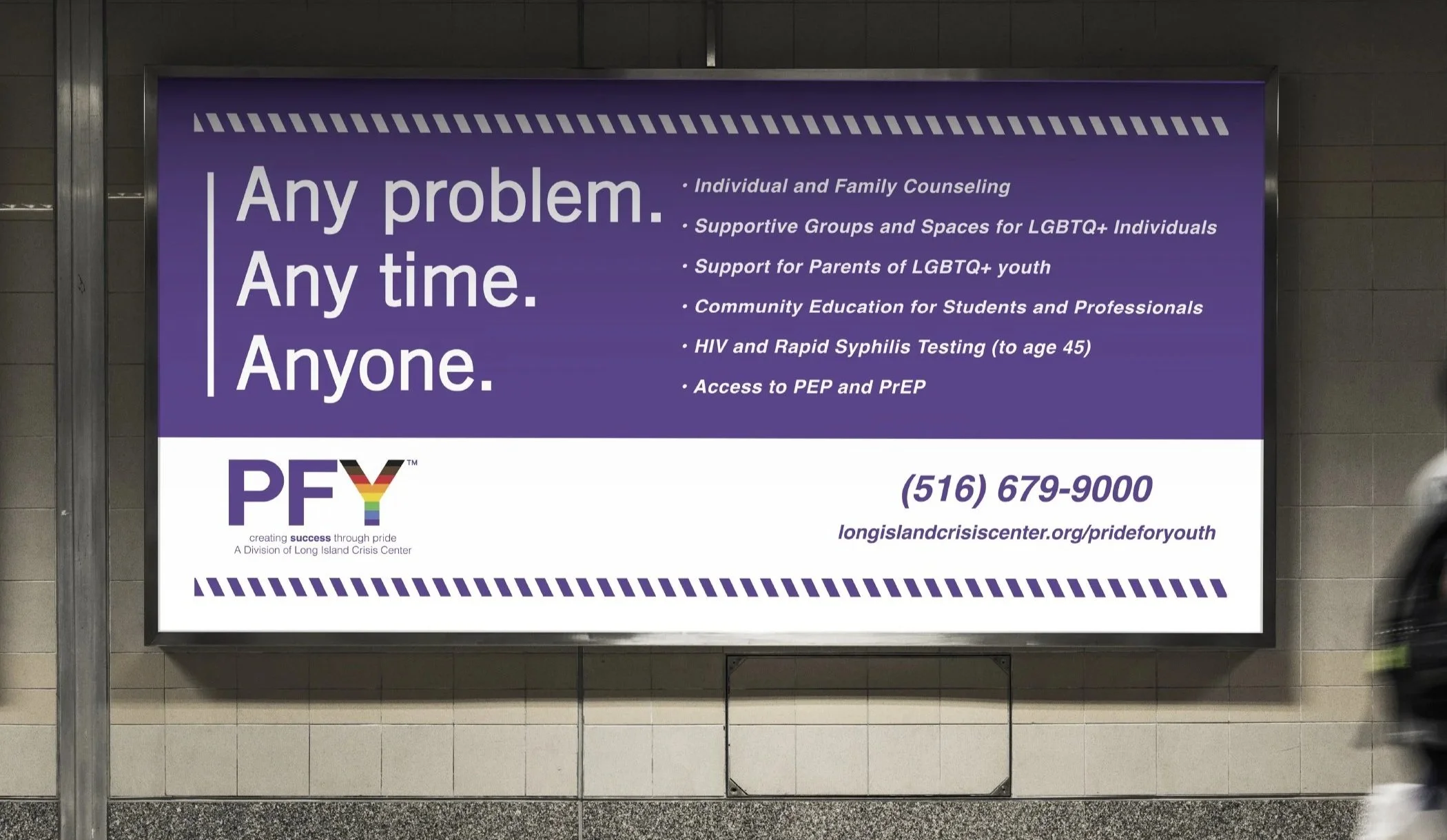
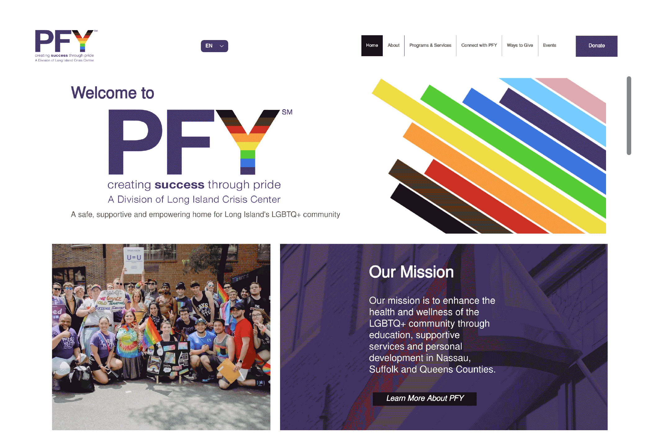
My goal was to create a sophisticated visual identity that went beyond logo design, delivering a seamless, unified experience across all brand touchpoints. PFY’s branding reflects its creative, inclusive, and welcoming spirit. The bold, simple monogram—with the pride flag placed in the “Y”—symbolizes PFY’s commitment to the LGBTQ+ community. The color palette combines vibrant positivity with approachability, using shades of purple and pride colors to celebrate authenticity, inclusivity, and belonging. This design approach carries through PFY’s marketing materials, signage, and communications, ensuring every interaction feels polished, meaningful, and impactful.