The North Face Branding, Packaging, Print + Digital Advertisements
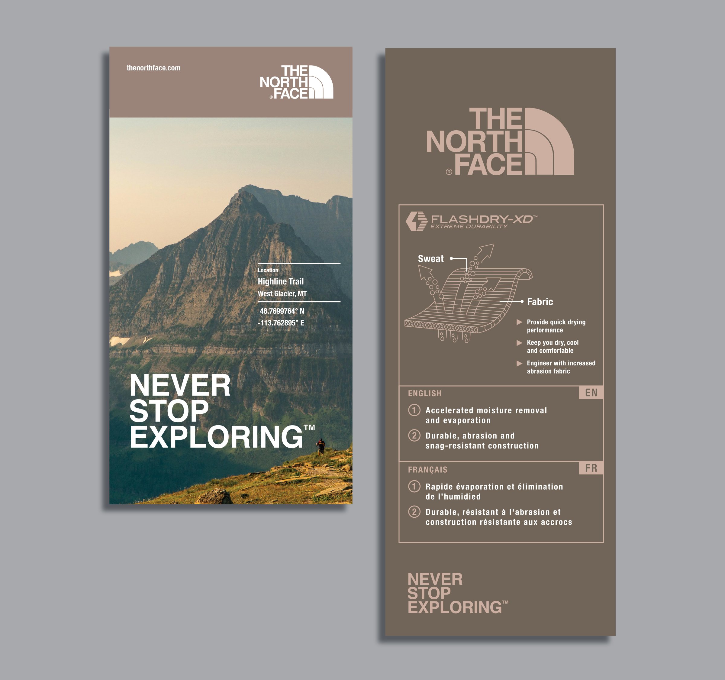
Keeping The North Face’s iconic “Never Stop Exploring” mantra and outdoor vibe at the forefront, I devised a color scheme for their Brooklyn location featuring subdued, fashion-forward earth tones, echoing the brand's adventurous and outdoor spirit. To enhance the brand's aesthetic and outdoor lifestyle narrative, I crafted illustrations for in-store end caps featuring trees, mountains, a tent, and a climbing carabiner – all emblematic of The North Face's "Never Stop Exploring" ethos. The primary, muted tones formed the foundation of our earthy palette, complemented by neutral, secondary colors for a refined finish.